The content marketer’s secret weapon: using data as content

As more companies take content and audience seriously as a marketing function, the bar for audience attention continues to rise. It’s always been incredibly challenging to break through the noise, but we have a secret weapon we’ve been using: data.
Instead of creating another “Ultimate Guide” or “Top Ten Best Practices for xxxx,” consider stealing a page out of our playbook and use data to make your content stand out.
When we write stories using data on our blog, our content analytics dashboard shows that they get three and a half more search referrals, four times more views per post, four times more engaged minutes, 13 times more social referrals, and 16 times more social interactions. It’s hard to argue with that.
Here’s how we got data to work for our content, and the steps you can follow to make it work for your company and brand. Here are the key moments of our “data as content journey”:
- Asking hard questions of data sets
- Identifying data people care about
- Turning that data into content (in sometimes surprising ways!)
- Making the most of the data and your content
How we started with data as content
In 2013, we faced a challenge: how can we prove to the industry that data can and, more importantly, should be used by those creating content. If used at all, we saw data being used in content as a supporting argument.
There’s nothing like a cold, hard, data point to convince you that you should be putting your CTA above the fold, or that the latest marketing technology really does produce results.

While these data points can work, they also have issues if you really dig into them. You have no idea if the number comes from a statistically significant audience size, how the survey was designed, or if it was completely made up – I’ve seen it happen!
Plus, we wanted to take data further, from supporting argument to main event. We sought to make data emotional and to turn it into something that would resonate with a potential audience, not just show up as a bullet point on a slide deck.
The problem? Excel sheets don’t normally convey thoughts about emotions, unless you count frustration.
The data set we started looking for had to meet one main criteria: People had to actually care about what it meant.
Why should we care? Asking hard questions of our data
Since we analyze first-party reading behaviors of over 10 billion internet views a month across roughly 1/6th of the internet, we thought that there must be something about that behavior that would interest any content creator.
We started asking questions and looked to see if our data could answer them. Just like interviewing a subject for a story, or researching a topic, we wanted to really dig in to find the interesting outcomes.
Here are some of the initial questions we asked:
- What time of day do most people read online?
- What impact do loyal audiences have on a site?
- How long is a typical post’s “lifespan”?
- How does placement on a home page impact a story’s readership?
And these are only the ones that made it far enough for a full data study; a bunch of questions fell on the proverbial cutting room floor.
What makes exploring questions both exciting and a bit frustrating is that you really don’t know whether the answers will be interesting or not until you ask. And there’s plenty of data that basically supports existing assumptions.
For example, we found that people read more in the early mornings and evenings during the week, and they don’t read a lot on weekends and holidays. Shocking, I know. While it’s good to test our assumptions, proving them right doesn’t exactly make for thrilling content.
Finding the data people really cared about
One question we asked early on was, to us, a pretty basic one: what sites drove the most traffic to articles?
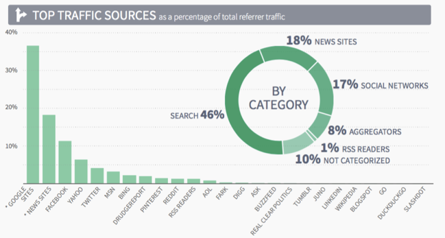
Digital content and sites had just started to really upstage their big sibling: print content, and the world was starting to realize how massive the digital platforms’ power over content had become. And that power would only get bigger. Notice that in our data from 2013, Facebook still sent less traffic to content sites than the hyperlinks that linked to other articles on different sites sent.

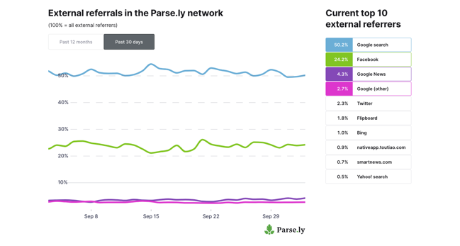
Each quarter or so, when we asked a new question about our data, we checked back in on these numbers. Did they change? And they did, quickly. Suddenly, people started asking us questions about this, they wanted updates to the latest numbers, and to compare their stats to our network averages.
(The history of how Facebook came to dominate eyeballs to content through the News Feed can be found throughout our blog.)
Turning the data into the content, no text needed
Often when people think about “content” they have formats in mind: blog posts, videos, social media posts. Content marketing expert Robert Rose, advises that thinking about what you want to communicate before you think about format:
“The trap of form applies to business content, too. As business communicators, we almost always think form first. To solve a particular challenge, we say, “We need a website” or “We need a white paper” or “We need a printed manual.” Only then do we say, “Great, what kind of content should we pour into that form?” I’ve seen many amazing big ideas get trapped in the form of a blog post, a white paper, or a printed article simply because that’s how the ideas were initially conceived.” – from Robert Rose, Content Advisory
And when your content is data, this is especially important. We saw success in almost all of our metrics writing about our data: our blog posts had high views, our Authority Report saw huge download numbers, our press mentions went through the roof. But instead of trying to write a story about this data every single time it changed (and sometimes, it didn’t), we decided to release the data as the content itself.

However, this page has flaws. Before we released this page, we talked about how great it would be to be able to let people embed the chart, or make sharing easier, but we got it out there so that we could test the content and see if we needed to do any of those things. I’d describe this as a MVP of data as content!
And for three years, this page brought the most visitors to the Parse.ly website. Beyond the high volume of pageviews, this page drove actual conversations. It was a starting point for something to talk about, and we received thoughtful, interesting questions about our data from our audience.
Make the most of the data content
Seeing the success of the referral dashboard allowed us to continue to invest in additional formats and coverage for our data content, as well as resources for other, related products.
- Our amazing product team built an actual fully-fledged product, Currents, that allows users to see the data we showed in our original web page, and so much more.
- We devoted a full-time data analyst to dig deeper into our content, so she could ask those interesting questions all the time.
- We produced two seasons of a podcast, The Center of Attention, featuring our data.
- We continue to report on changes to referral data from Facebook and Google, and the impact it has for people creating content
But what data can I use?
Okay, so that’s how our team uses data to create content, good for us.
The key question for anyone who wants to copy this strategy is to identify the data you have access to that’s interesting to your audience. Here are a couple of pointers on finding that data:
Internal app or database data
In our case, we used data created by our first-party content analytics system that clients use to power their content strategy. We anonymize the aggregate information, and create data from it. This could work for you if your service or company has a tech product or associated app. For example, Weight Watchers (WW), could examine the types of food people eat who lose the most weight. TripAdvisor could interview the owners of local restaurants with the highest ratings. Casper could even use purchasers’ zip codes to see if they correlate with increasingly popular neighborhoods as people move into new apartment buildings.
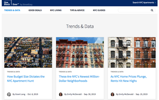
StreetEasy does a great job of using its data to power content. From listicles showing its most popular listings Most Popular Listings of September: 5 Homes StreetEasy Users Loved Most,to providing in-depth market research written by Senior Economist Grant Long (often cited by The New York Times and other major news outlets), like NYC’s Unsold Condos: Thousands of Units Linger on Market as More Are Built, StreetEasy makes the most of its trove of data to power its content strategy.

Publicly available data
Using internal data isn’t always an option. For one, it usually involves a lot of cross-team coordination and it can be difficult to get buy-in for that at larger companies. Second, depending on your industry (finance, health care, etc.), there may be legal or regulatory reasons that internal data shouldn’t be shared as content.
While data that you own can make you stand out, doing interesting things with publicly available data can be every bit as brand defining and compelling to your audience. Entire media outlets, like 538 and The Upshot, exist just to cover data and data stories.
Need some inspiration? If your brand touches sports, there’s no shortage of stats available for analysis. Browse academic journals for published data that your audience would find interesting (but would never think to look there on their own!). The Pudding even managed to make population data surprising simply by using data visualization to change the perspective on the numbers.
Your data as content strategy: is it working?
Ready to put this into action? Here’s the framework you can follow as you try out a data as content plan.
- Find data sets, either internal or external
- Ask questions! Test out the answers as content, and see what resonates with your audience.
- Iterate until you find the data you know will consistently be interesting
- Reimagine how you can present this data to your audience
- Use the content in multiple formats
Throughout this process, you’ll want to make sure that the effort you’re putting in will pay off in the long run. Track your results using a content analytics system. Compare your data content to non-data content to quickly assess whether you should devote more time and energy to a data set, or if you should move on and try something new.
And let us know if you try out a data strategy, we’ll even get you a pizza for a planning session. Email us we’ll make sure that your team has a full stomach as they think through the data planning process.
This post was based on a presentation I gave this presentation at Content Marketing Worldin Cleveland in September. Interested in seeing the whole thing? To purchase video access to my session as well as other breakout and keynote sessions, visit CMWorld’s post-show video portal.