Among AT&T’s entertainment assets, Game of Thrones gets the most attention. Here’s how we used Wikidata’s entities and ontology to find that out.

At Parse.ly, we measure how much attention content receives, and broadly speaking – it’s a lot. We directly track how many page views individual URLs receive from visitors. In the last three years we’ve tracked about 480 billion page views on about 250 million distinct pieces of content; most of this content consists of articles from leading U.S. and European publishers. That’s about 21 page views from every human on earth and 2 new articles every second for the last three years.
As part of our focus on measuring attention on content (e.g., news articles and blog posts), our system parses the full text of every piece of content in our dataset. We’ve built a system using Natural Language Processing that automatically knows which people, companies, and products are mentioned on each URL.
In my role as Machine Learning Engineer, I’ve been working on discovering the insights this data can show us about what it means when people pay attention to certain topics or stories. I want to enable anyone to view how any kind of entity is trending across all the content we track.
The challenge: bringing together a large company’s most popular products and brands
When we show people our Currents dashboard, they often want to see how much attention a particular company receives, and why. Professionals in corporate communications, PR, and finance constantly need to understand the public’s reaction to a brand or product. This would allow them to see how people read directly about these companies on trusted websites (in an anonymized way), instead of relying on proxy signals like social media engagement.
For example, imagine you’re, say, Warren Buffet and you’re considering investing in a media/telecom behemoth. You’re baking AT&T off vs Comcast. On the telecom side you can easily discover how many subscribers these companies currently have, because that’s publicly reported. But how do you value their media and entertainment brands and assets? E.g., how do you measure the value of brands like Superman (owned by DC Comics → Warner Bros. → WarnerMedia → AT&T) or Saturday Night Live (owned by NBC Studios → NBCUniversal → Comcast)? Given that each of these companies owns thousands of these types of assets, how do you determine which ones are the most important?
What we really want is a way of comparing overall attention of AT&T’s and Comcast’s brands, as well as a break-down of the most important brands/products that explains why one company is getting more attention than the other. In a world where Netflix is “competing with Fortnite,” understanding what people pay attention to can map to where they decide how to spend their time, and dollars.

Google Trends can show some intent data, but it can’t aggregate attention this way. While it’s our aim, so far our Currents product can’t either. Instead, these tools can only give us a chart like the one above. In the case of our data, it indicates how many times readers in our network read articles that featured either the company ‘Comcast’ or ‘AT&T’.
This chart largely neglects the page views the company’s assets (brands, movies, T.V. shows) receive. The chart above really only tells us how much attention the top-level companies receive, either in their role as telecoms or public companies. The big spike in the end of 2017, for example, is caused by lawsuits surrounding AT&T’s acquisition of Time Warner.
Now remember, you’re Warren Buffet still, and as Warren Buffet, you already know about that controversy, and know that it settled. What you really want to know is which media and entertainment assets are most valuable for these companies, and how attention to them is trending. You actually want the following plots, which shows how much attention AT&T’s vs Comcast’s top assets and brands have received over a three year period:


To generate the charts above, I didn’t just select some arbitrary assets that belong to each company and plot them out together. I used an ontology to catalog all of the major assets belonging to each company, and sorted them by the number of page views they received. Before looking at these charts I had no idea that Game of Thrones was AT&T’s most read-about entertainment asset (makes sense in hindsight though), and I didn’t know that AT&T’s entertainment portfolio is stronger than Comcast’s, in terms of media coverage and people reading about it.
The charts above can provide investors and other professionals with insights that internal company data can’t provide: by this measure, AT&T has a stronger portfolio of entertainment assets, especially via Game of Thrones and the DC comics brand.
A savvy investor would treat these lists as the starting point for a larger investigation, and look into the health of each of the top few dozen assets for each company. This investigation would reveal that Comcast’s Friends has been licensed by Netflix for (rumor has it) $100m — the investor should then ensure that the amount of attention being paid to Friends is not waning.
So, Warren, how do these charts affect your valuations of Comcast vs AT&T?
Creating the charts above in an automated fashion is a hard problem for huge companies with byzantine, hierarchical structures like Comcast and AT&T. In the rest of this post I’ll go over how I did it.
The role of Wikidata: not only a set of entities to link to, but also an ontology
When we run natural language processing algorithms over the full text of our content, one of the key things we extract is the list of entities (people, places, products, companies, idea, etcs) that are mentioned in that piece of content. This task is known as entity linking, and at a high level the goal is to extract nouns of interest and link them to a set of known entities.
The set of entities we use comes from Wikidata, a project closely linked with Wikipedia. Thus, the kinds of entities we can detect in our content are the kinds of things that have Wikipedia pages written about them. Basically, the entity linking algorithm takes the content’s full text as input, and, where possible, annotates each noun with a wikidata_id and a relevance score. We keep only those entities that have high relevance to the article at hand.
Linking entities to Wikidata is ideal for our purposes because it includes a disambiguated set of nearly all entities that are news worthy. However, there’s an added benefit — Wikidata is actually an ontology. An ontology can be thought of as a database of rich statements about how entities are related to each other. For example, if you visit the wikidata page for Game of Thrones, you’ll see it contains statements establishing that ‘HBO is the original network of Game of Thrones’, and that ‘HBO is the production company of Game of Thrones’.
These statements also contain relationships about products:
- Foxconn manufactures the iPhone X
- Apple designed the iPhone X
- Random House publishes The Cat in the Hat
Thus, we can use Wikidata to link products/assets/brands with the companies that own then: we can attribute page views on Game of Thrones to HBO.
But that’s not quite good enough: how do we attribute that attention all the way back up to AT&T? It turns out we can use Wikidata for this task as well: we just query it for parent/subsidiary relationships between companies. The result of such a query gives us a list of directed edges i→j, indicating that company j is a subsidiary of i.
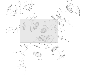
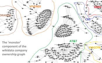
If we connect all these edges, we’re left with a graph (i.e., a network) of public companies and subsidiaries. Ideally we’d have a separate, disconnected component for each public company, where each component contains a single parent company and a clearly directed hierarchical ownership structure. However, as is often the case with crowd-sourced data, the data contains some noise/garbage. Instead of neatly separated companies, in many cases different companies are connected to each other. In the worst such case – the giant connected component – we’re left with a hairball that I call the ‘monster’.

Zooming in on the monster, we see that it consists of communications, media, and entertainment companies. The central section of the monster features AT&T at its center, connected to CBS, Vivendi, Sony, Viacom, and Orange. In the further periphery of the monster we find various oil and manufacturing conglomerates.

The existence of such a monstrous clump of companies connected together in the Wikidata ontology is problematic for two reasons:
- There are some companies that have multiple owners, and in such cases it can be unclear which public company attention should be attributed to.
- The existence of cycles in this graph is even more problematic: cycles occur when one can follow ownership relationships around in a circle. Circular ownership schemes may exist in some private companies, but we don’t expect to see them in public companies.
Taming the monster by cutting it up
It turns out that only a few stray edges in the monster prevent us from attaining this ideal situation. After looking into a a dozen or so of these stray edges, I found that they most referred to obsolete ownership relationships that was invalidated either by a subsequent merger or acquisition, or by a company simply being disbanded.
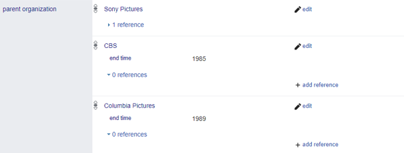
The good news is that Wikidata includes way of qualifying an ownership relationship so that it’s only valid for a particular interval of time. For example, here’s a list of statement showing who owns TriStar Pictures.

Notice the end time qualifiers on the statements showing that CBS and Columbia Pictures own Tristar. If these were missing, then TriStar would appear to have three different owners, which is problematic.
After visualizing and examining this ‘monster component’ it became clear to me that I could fix the problem of stray edges by simply correcting Wikidata myself by hand. Stray edges are a problem, but they’re a rare problem — with visualization I could easily identify where the stray edges were, and with network analysis software (I use NetworkX) I could automatically identify cycles.
Using these two techniques to single out the problematic edges, it was a simple matter of reading the Wikipedia pages to figure out how I could correct the problems — for example figuring out when companies were sold to each other so that I could manually add the relevant ‘end time’ qualifiers to Wikidata.
After updating a few dozen obsolete parent/subsidiary relationships, I would regenerate the company ownership graph, revisualize it, and once again look for the most egregious stray edges. After several rounds of this, the monster component fell apart into several different cleanly separated companies, and I moved on the the next-largest component (a mess of energy and engineering companies), and broke that up.
You can view my wikidata contributions page to get a sense of the edits I made — all in all I guess I made a couple hundred (I made half of them while accidentally logged out of Wikidata so they don’t appear under my contributions). It was tedious work that took about eight hours, but, given the wealth of information that Wikidata provided me, I was happy to contribute something back in return.

After carrying out these corrections, it was possible to much more cleanly visualize a company like AT&T:
With this hierarchical structure in place, I could now cleanly associate subsidiary companies in Wikidata with their parent public companies. While a crowd-sourced dataset like this is never perfect, with just the minor corrections I made it was good enough to to perform meaningful analysis of how much attention public companies receive.
Tying it all together into an automated process
The goal we set out to achieve above was to make it possible to track the overall attention that any large company’s products and brands receive. I’ve gone over how Wikidata allows us to carry out two key tasks necessary for achieving that goal. First, Wikidata gives us a clean, disambiguated, and large set of entities that we can link words in articles to. Second, Wikidata’s ontology allows us to determine which companies own which products and resolve parent-subsidiary relationships.
With that data in hand, I can create the following revealing charts with just a few SQL joins, like these ones comparing attention for the top iPhone and Samsung Galaxy models over the last three years:


Future work: Adding positive or negative sentiment
There is a lot to say about the charts above, because each large spike corresponds to some kind of event, launch, or problem. In the first chart, you can see that the most recent iPhone launch event attracted much less attention than the previous two. The second chart reveals that Samsung Electronic’s largest spike of attention corresponds to late 2016. This spike was caused by the notorious Samsung Galaxy Note 7, which was plagued by battery combustion problems. The phone caused fires, was banned on flights, and eventually recalled. Thus, not all attention is good attention.
We saw the same thing in the earlier charts above for AT&T and Comcast—the large yellow spikes in AT&T’s chart represent something positive: on the days where new Game of Thrones episodes aired, masses of people want to read about it. The huge spike in the bottom chart, on the on the other hand, represents something negative: Matt Lauer being fired by NBC due to allegations of sexual misconduct. There’s a lot more to say about these charts (and all the other one’s we’ve generated), but I’ll have to save that for a future post.
In conclusion, a word on what we’re working on now. We’ve recently started training language models based on recent deep learning breakthroughs in NLP to automatically classify an article as providing positive or negative sentiment towards companies. So far, this approach has produced promising results, and allows us to cleanly separate positive attention from negative attention—subscribe to the blog to get updates on our progress.